Palette
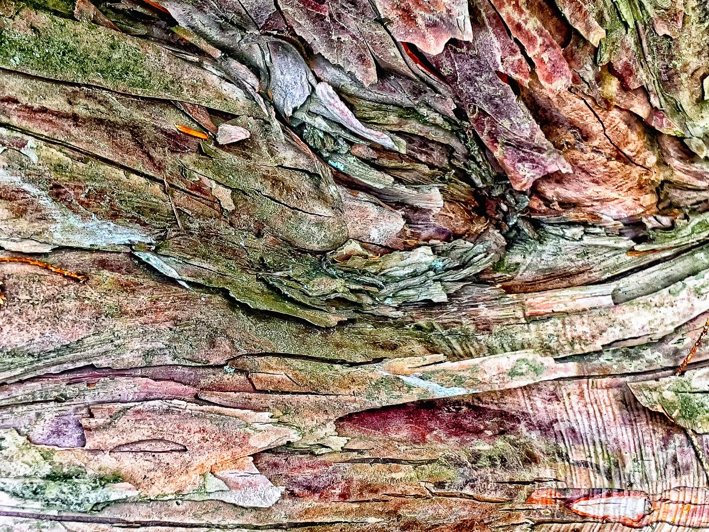
Look at the top image - all these colors are in the original unprocessed image and in the bark of this spruce tree. That said, I will own that I have manipulated the color and texture more than I usually do. I really love the soft palette and the range of colors and textures. I’ve spent more time than usual getting rid of noise, those distracting artifacts of digital imaging.
What you see in the second shot is processing that is more faithful to what was actually present in real life. It is comparatively subdued, although still pretty extravagant, especially if you hadn’t seen the more heavily processed version.
This is a great example of why I process images multiple times. I’m not averse to bumping up contrast or saturation if it strengthens the image. But it’s always helpful to go back to the original to consider where it came from and where I’d like it to go.
In this case, I’ve come to the conclusion that less is more - while the more heavily processed image is flamboyant and striking, I do prefer the second shot, both on its own and in the context of the series as a whole. The extra processing paid off with a stronger image.
What’s your take??